Movetic
Movetic is an award-winning brand strategy and digital agency that fuses passion and energy with strategy, creative, and digital to create custom solutions that move brands forward in the modern world. Movetic is made up of designers, strategists, wordsmiths, shooters, marketers, and technologists that are obsessed with creative perfection and solving complex business problems.
I joined the team at Movetic to strategically develop brand identities, craft innovative digital experiences, and to ideate and produce creative materials for Movetic’s clients. Each project presented a unique set of creative challenges that required close internal and external collaboration, creative problem solving, implementation of strategic creative processes, and a wide breadth of knowledge and skill.
We created engaging user experiences and brand narratives to connect with users. We produced striking imagery and leveraged storytelling to build emotional connections between brands and consumers. We utilized design, relationship building, psychological, and communication strategies to develop brands and drive brand affinity. We worked hard and smart, and here are the results:
Branding
Graphic Design
Photography
Research
Results


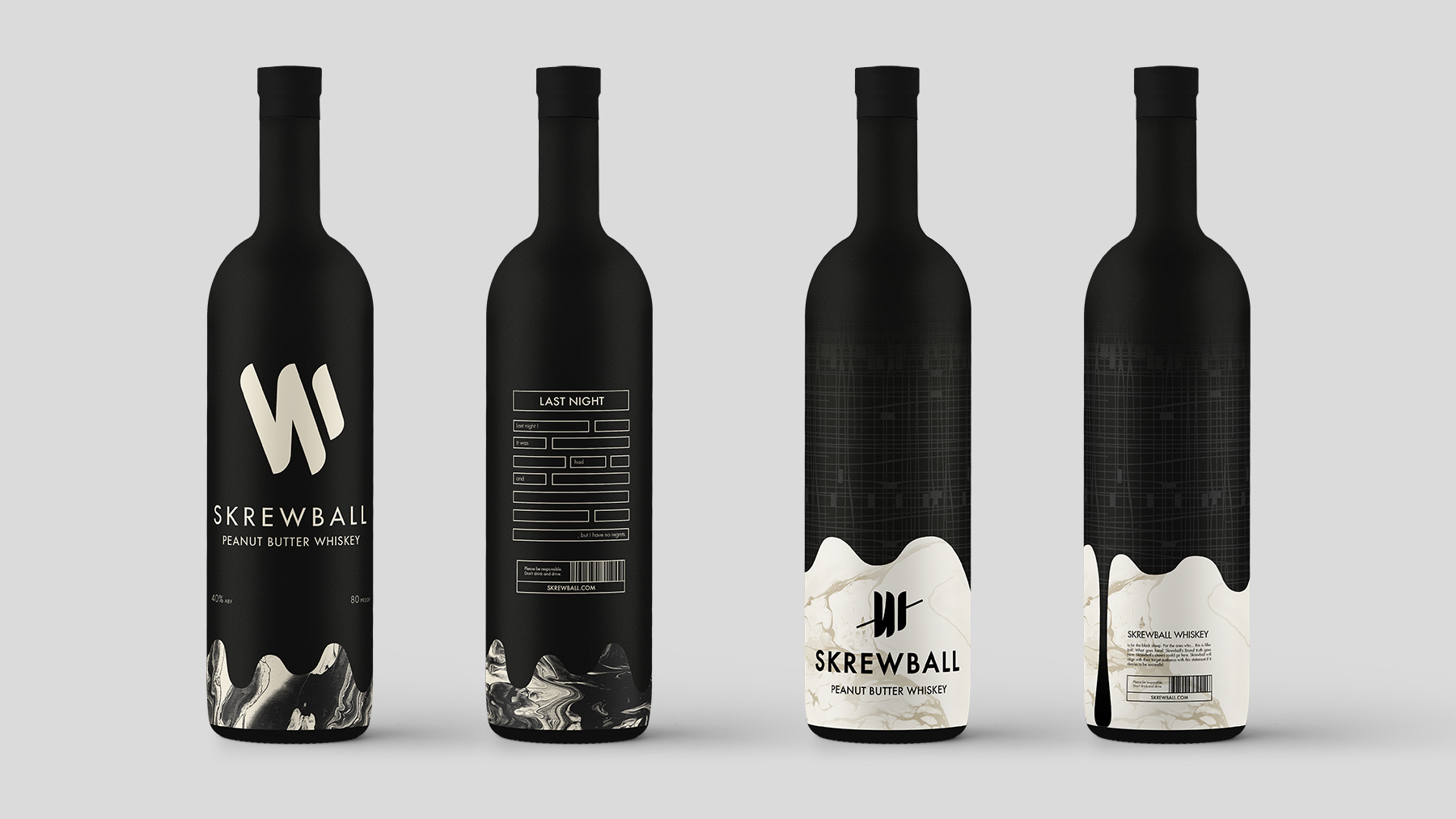
Skrewball Whiskey
2018 American Advertising Awards Winner: Gold Award, Logo Design
Skrewball Whiskey is soon-to-be peanut butter flavored whiskey liqueur brand. The owners of Skrewball hired Movetic to design their logo, packaging, and identity.
I joined Movetic when this project was already under way. The product name, bottle type, ideas about the general identity look and feel, and the content of the logomark were decided - which presented a unique set of challenges and opportunities for our team.
My contract at Movetic ended before the project was completed, so the following work samples are rough results from various stages of our creative process - none of the designs are finished.
Additionally, as my contract ended before the project was completed, I am not responsible for the the final design decisions made by Movetic or the client. Please keep this in mind when researching the brand and viewing the following work samples.
Skrewball is an incredibly unique product; this project demanded a thoughtful and creative design strategy to drive product consideration. The concept of peanut butter whiskey, the look of the product, and the bottle - a brown bottle with a shape reminiscent of a wine bottle - were challenges that we welcomed.
With an arduous attention to detail we discovered Skrewball’s brand purpose, developed and refined proto-personas to help us align with our primary and secondary target audiences, and leveraged a refined creative strategy to produce a stunning brand identity.
Tempting as it was to merely create a striking visual identity for Skrewball, I wanted to ensure that this brand would truly connect to consumers and provide long term opportunities to build brand-consumer relationships. Throughout our creative process, I constantly asked myself how to ensure value congruency with our target audiences, how to leverage consumer-product interaction to build relationships and promote social sharing, how to use design to provide story-telling opportunities, and more.


Ideation and Exploration
We brainstormed hundreds of ideas and created countless sketches after completing the discovery phase. From there, we began to distill down our concepts - we weeded out the weak and improved those we could defend with strong objective reasoning based on sound design strategy. Countless iterations are paramount to the production of effective design solutions; the first idea is rarely the best.
Each design decision I made was deliberate and consciously made to create a strong visual identity, facilitate product-consumer interaction, promote social sharing, build consumer relationships, provide opportunities for long-term marketing initiatives, and to overcome our design challenges.
The images above include only a paucity of my sketches, texture explorations, and rough designs. If you’re interested in learning more about the ideas I produced in this phase of the creative process, feel free to ask to see more.
Please understand that these are explorations; they are not final design samples. We worked in close collaboration with the client to further distill our concepts as we progressed though our creative process. Additionally, please understand and keep in mind that many of the following work samples were guided by client decisions.
Bottle Concepts
I was given responsibility to develop concepts for the bottle and labeling before we had finalized Skrewball’s logotype or logomark because the end of my contract was quickly approaching.
The owners of Skrewball wanted to create a brand that strongly valued individuality and unconformity - a brand for those who boldly embrace being different and always make their voices heard. They had a tenacious grip on their core values, and wanted to create a brand for the black sheep.
As many prospective customers would likely feel apprehensive about purchasing a product as unique as Skrewball, creating a strong brand identity that would resonate with Skrewball’s target audiences on an emotional level was paramount. Rather than attempting to drive product consideration by force-feeding prospective customers a list of superlative-based product attributes, I strived to connect with the culture of Skrewball’s target audience and create authentic relationships by providing a killer brand experience.
Skrewball’s brand philosophy served as the foundation for my creative strategy. I wanted to create relationships with prospective customers through value congruency, product-consumer interaction, product storytelling, and by providing a canvas for self expression.
The following concepts are very rough - they are not final designs and require refinement. As I mentioned before, I created these concepts before we had finalized the Skrewball logo. These explorations were conducted to find creative ways to build customer relationships and to overcome design challenges. These explorations led to concepts that allow consumers to express themselves by using the bottle as a creative canvas, that provide product storytelling opportunities, that encourage social sharing, and facilitate the creation of future campaigns and guerrilla marketing.
An invitation for customers to create interesting stories on the bottle.
This pattern becomes readable text when viewed from a drinking angle, which creates an interesting user experience.
About the concepts
The bottle I was required to work with presented one of the most salient design challenges of this project - the shape of the bottle was nearly (if not) identical to the shape of most wine bottles. Preventing an undesired association between our client’s product and wine was paramount.
Creative problem solving and concept exploration illuminated the fact that the long shape of the bottle provided an opportunity to use a dripping peanut butter effect to both disassociate the bottle with wine and to create an interesting and honest design that reflected the slightly viscous nature of the product it held.
Additionally, the bottle provided a large working area that allowed me to provide customers with a canvas to interact with, to incorporate storytelling, and to include details that would not be possible to include on smaller bottles.
These designs are far from completion, but they provide possible strategic solutions to this project’s design and communication problems. I explored creative ways to create packaging users would want to interact with and keep, ways to creatively differentiate the product, ways to connect with the target audiences on an emotional level - to connect with the groundswell and create long term brand-loyalty, and more. If you’d like to learn more about my specific ideas and the design solutions I explored, feel free to ask.
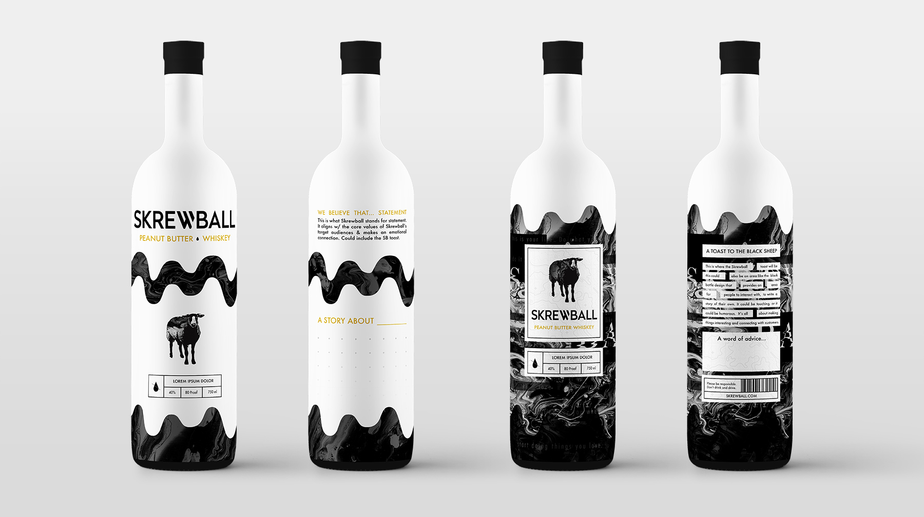
An invitation for customers to use the bottle as a canvas.
Dew Tour
The Dew Tour is an innovative contest series and content platform that brings together the world’s best skateboarders, snowboarders, skiers, artists, brands, and fans in a celebration of creativity and style.
We were hired to create an immersive, interactive, engaging, and on-brand Facebook canvas “advertisement” to be used in Dew Tour’s event marketing initiatives.
The vibrant visual aesthetic created by Steve Harrington for the event and the event culture inspired us to create something different for users to interact with. We wanted to create something that would provide value and a unique experience that users would enjoy.
The result was a thoughtfully crafted piece of interactive content designed to induce positive visceral, behavioral, and reflective reactions to ultimately increase user engagement, affinity, and brand equity.
Canvas
This is a mobile-only immersive experience - one that can't be experienced outside of the Facebook application. In app, users are able to interact with the canvas in multiple ways. For example, users can interact with video elements by moving their phones - users feel like they are with the skateboarders at the time of filming.
Other Clients
In addition to the projects featured above, I also worked on projects for Harcourts Auctions and The Salad House. I was responsible for editing and preparing images to be used by Harcourts Auctions, and created a menu and card for The Salad House. Please get in touch if you would like to learn more about the projects or see work samples.
Let's Get in Touch